ATAPCO PROPERTIES
INTRO
Atapco Properties is a Baltimore based commercial real estate development company. Planit has helped them rediscover their brand identity and is now in process of redesigning their website. They needed three designers to each come up with a web design that is in line with their recently set brand guideline. I took on the responsibility of designing one of them.
GIVEN
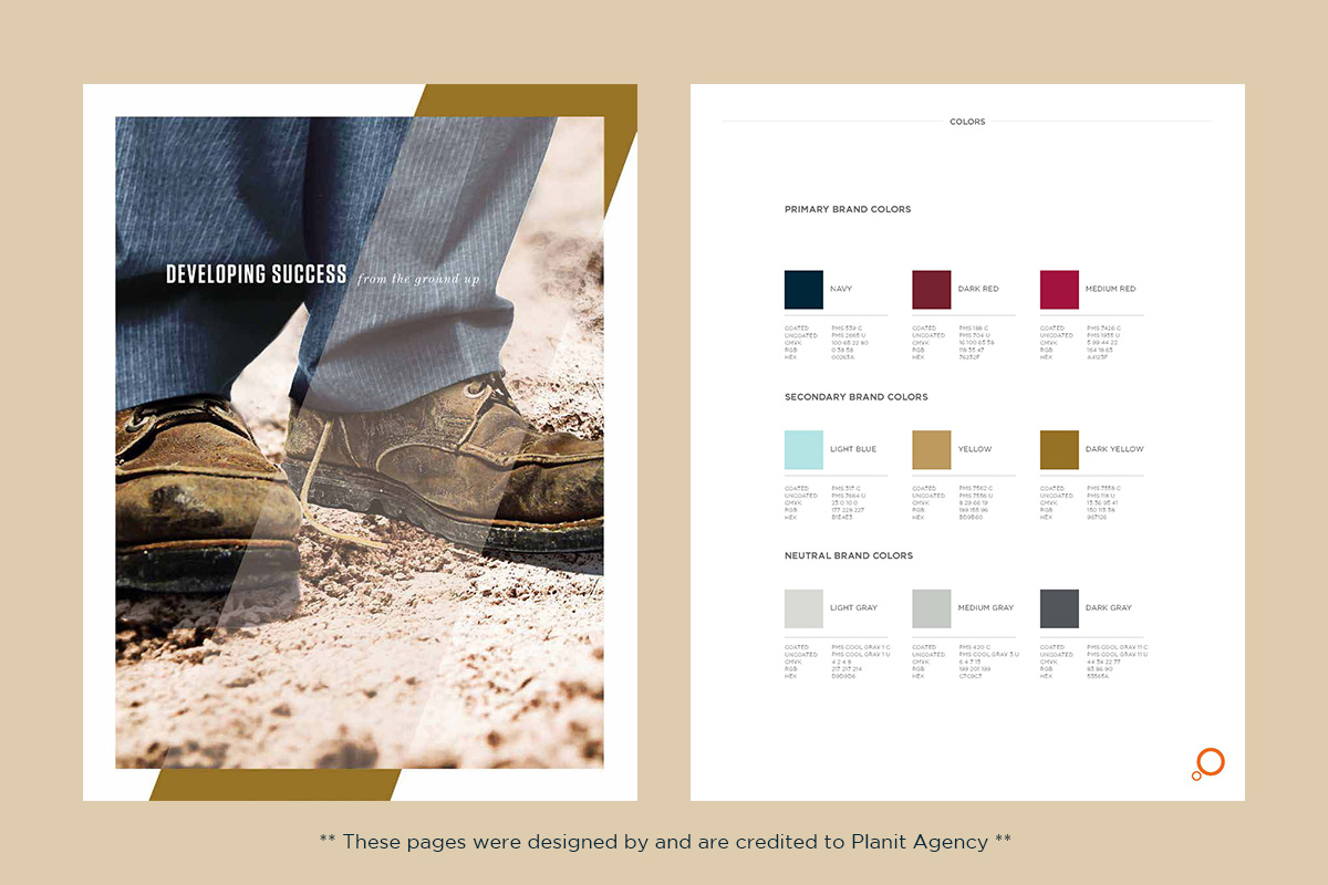
Since I was not familiar with their new brand looks, I was given Atapco’s Brand Exploration Guide that Planit had designed. It included their brand color palettes, fonts, and couple of images to help understand the mood and tone of their brand. They also gave me a wireframe to work off of for basic layout and functions.
FOCUS
From the Brand Exploration Guide, I learned that Atapco now has a sophisticated look yet still kept the roughness of the construction site. The guide included a page with nice clean streak of color with an overlapping text, which became an inspiration for my web design. It was an interesting challenge to combine the sleek modern look with the modest dirt-under-the-fingernail feel.
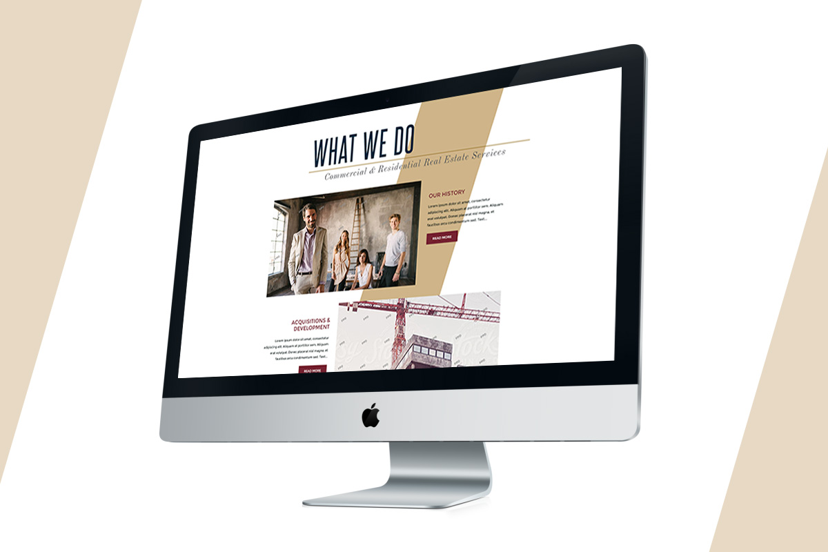
DESIGN
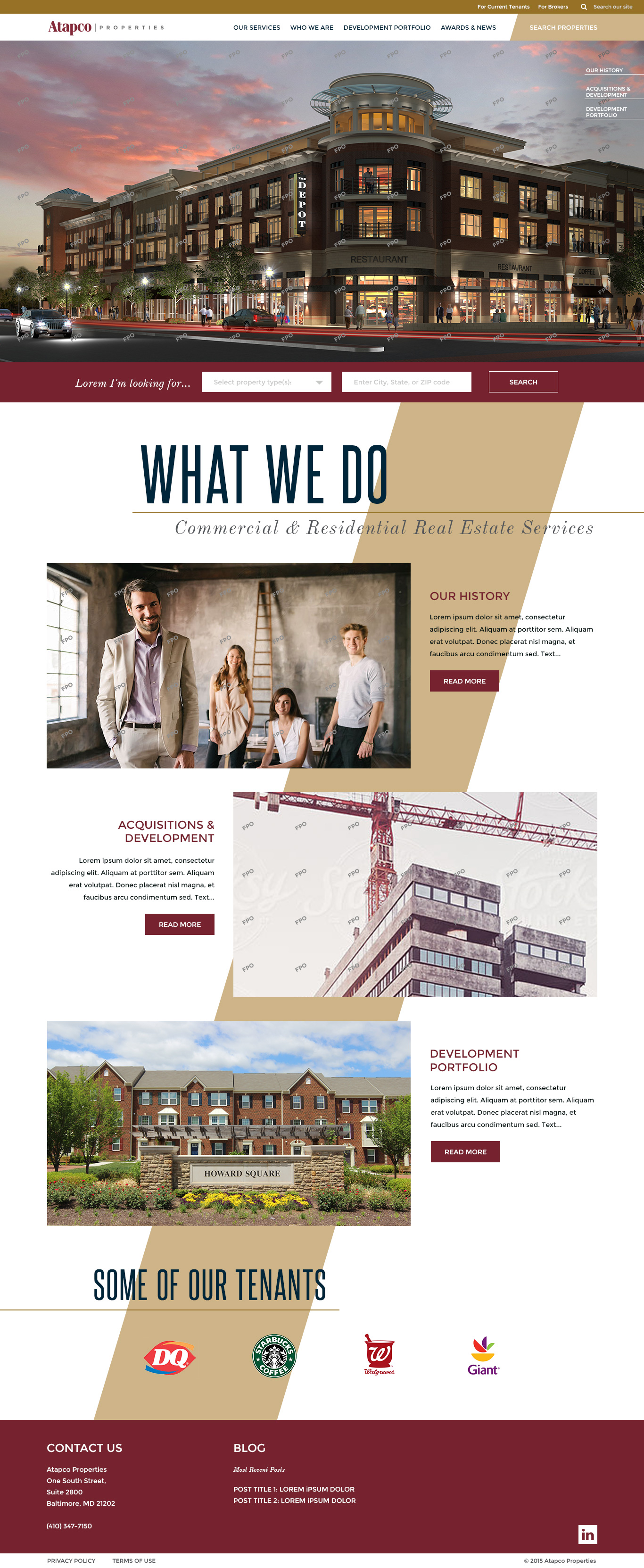
Deriving from the image in their Brand Exploration Guide, I used a streak of light gold color in the background. This streak, emphasized by the surrounding white space, naturally leads the viewer’s eyes downward. As the viewer scrolls down, the site begins to utilize the parallax feature. The background will move at a slower pace than the foreground, creating different overlapping moments at various places on screen.
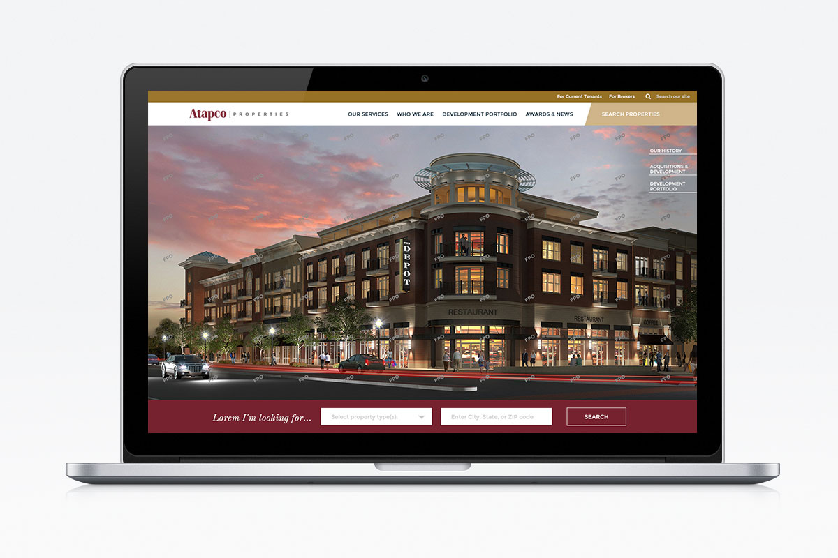
From the wireframe, I determined the most important function of this website to be the “search properties” function. In this homepage, it is emphasized in the red bar underneath the banner image. It is also included in the navigation bar and when clicked, light box will appear with the same search form.
Date:
08/01/2015