SoftBank ConnecTalk
INTRO
SoftBank is a large, multinational telecom company based in Japan. As the world is going more “mobile”, SoftBank felt encouraged to reduce the number of traditional desk phones and replace them with mobile apps. They asked Cisco/BroadSoft for a mobile communication app with BroadWorks backend that supported some of the call settings. I was asked to be the design lead for this project; fully responsible for UX design and oversee the UI team in India.
Our initial plan was to design and develop a whole app with full capabilities, but SoftBank had a client with more immediate need for only a few functionalities of the app. Therefore, we readjusted the requirements to fit their limited needs and have an “Interim Release” before the full app release.
PERSONA
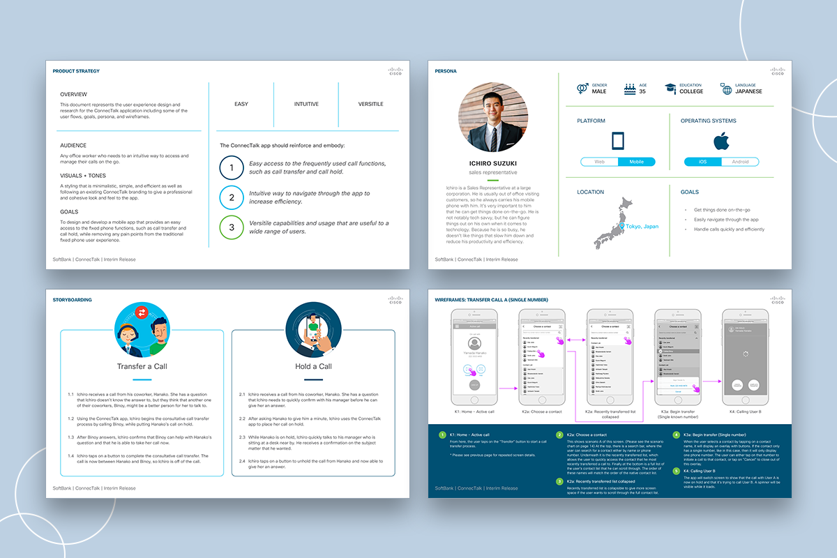
Since SoftBank is a large company and it has many different clients and employees, their persona had to be generic and wide-range. During our kick-off meetings, we discussed two different possible personas, but only one was necessary for this interim release phase. Therefore, I focused on a sales worker who is mobile and needed things on-the-go.
CAPABILITIES
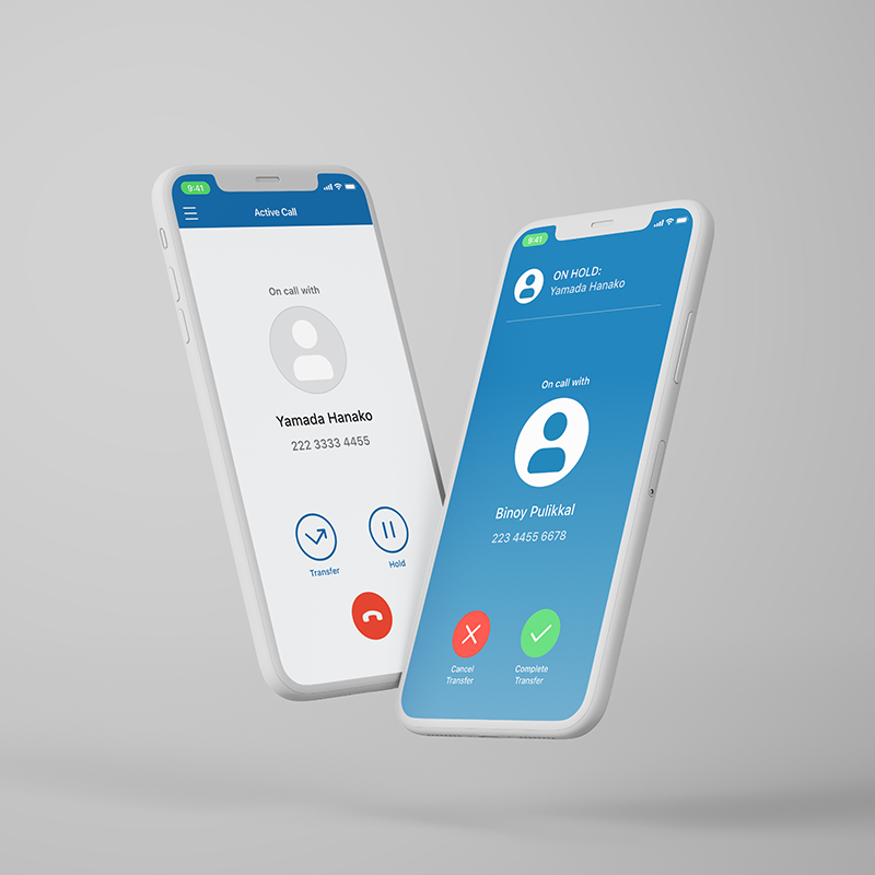
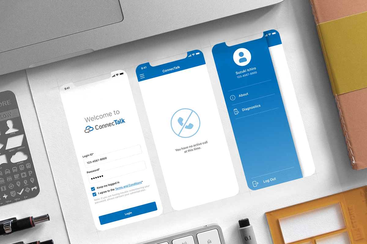
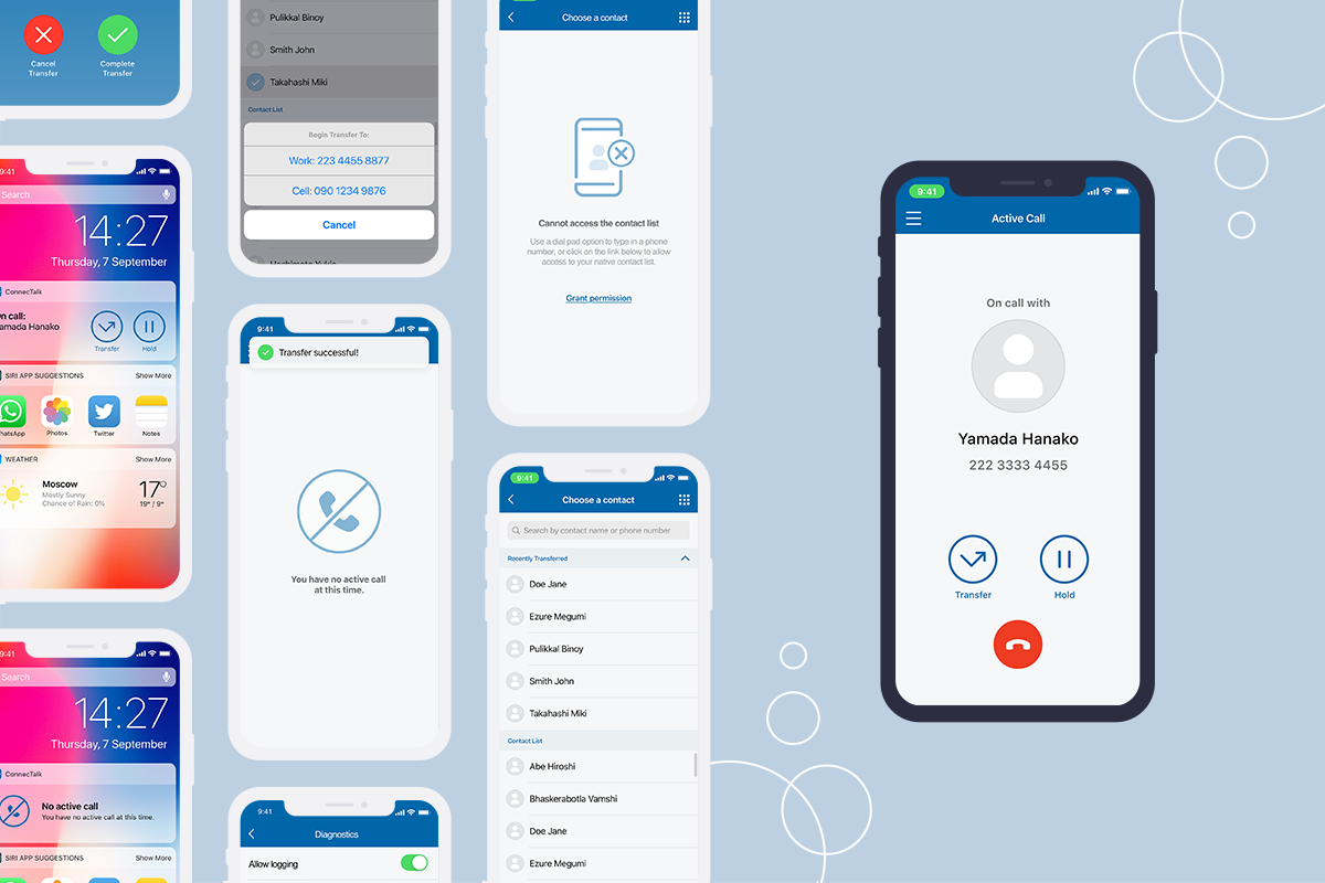
The main purposes of this interim release phase followed our two user stories. While there is an active cellular call on the device, the app allows the user to hold a call and/or begin a consultative call transfer. The app also includes other basic information such as the user info, app info, logs for support, terms and conditions, etc.
CHALLENGES
Even though this phase only had simple requirements, there were a couple of things that I had to keep in mind while designing:
- This was only a partial release of the full app. Based on our conversations with the client, we knew that they had more requirements that they want to add in the next phase of this app. This meant that the interim phase needed to have a flexible UX foundation that could handle more functionalities later on.
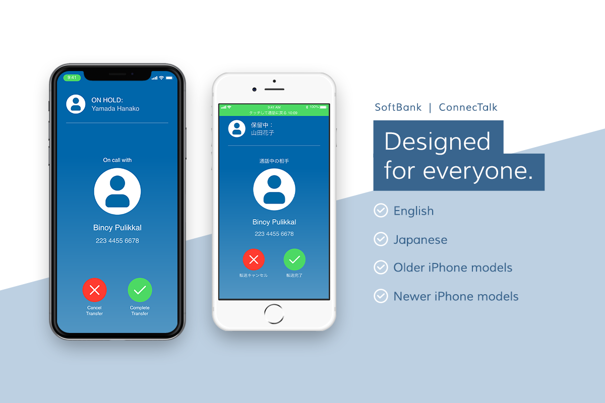
- Bilingual app. This app was to be released in both English and Japanese. We had to consider that Japanese involves “Kanji” characters that are visually more complex and dense than the English alphabets. We had to make sure that everything was legible and easy to navigate in both languages.
- Minimal branding. SoftBank team had provided us with ConnecTalk branding for this app. However, it was very minimal (only primary colors and a logo) and they had asked business/corporate look and feel. Personally, it was a challenge for me not to include more visual interest to the app.
TAKEAWAYS
This was my first time being a design lead of a project, as well as producing UX deliverables. I was very nervous before to interact with clients, but now I feel more confident to ask questions to clarify their needs and design what exactly they are looking for. This is an ongoing project, so I look forward to working on the next phase of this app.
Date:
11/01/2018